Tufford Group
Choosing to be more human in the age of AI.
- Project
- Brand and proposition, Customer and investor experience
- Company type
- Contact verification company, private company
- Year
- Q1 2026
The identity in under a minute: the line, the colour, the mark, the pattern and the site.
The brand stands for the person on the other end of the line.
Tufford verifies the client and shareholder contact records that deals and capital raises rest on, by picking up the phone. In a category racing to automate, the company chose to be more human and understood exactly why. The proposition came first, the identity carried it, and the site and the social system took it to market.
Make unverified contact data unacceptable in high-stakes business decisions.
The mission the strategy wrote sits under it. Protect companies from the cost of broken connections, the failed raises, the lost customers and the bad deals, by verifying what software cannot: whether the relationship still exists.
They weren’t chasing awards, applause, or creative industry ego. They were focused on one thing: taking us, and twenty years of hard-earned credibility, to the next level.
The proposition
It's time to drop the small town feel.Sean Tufford
- The proposition
- Tufford Group is the only contact management company that verifies relationships through genuine human conversations. Not bots. Not scripts.
- The category
- The opportunity is to move beyond 'data cleaning' and own a more valuable category: relationship verification.
If it's not verified, it's not valuable.
From the value proposition and brand strategy WAO wrote for Tufford GroupThe identity
We had outgrown our own brand.Sean Tufford
Those words came out of the strategy and went straight into the drawing. The mark is a person, a head above a body, and it inverts across its own diagonal; that diagonal cuts the pattern, the posters and the stand. The colour is one gradient, from amber to a deep orange, warm where the category is cold.



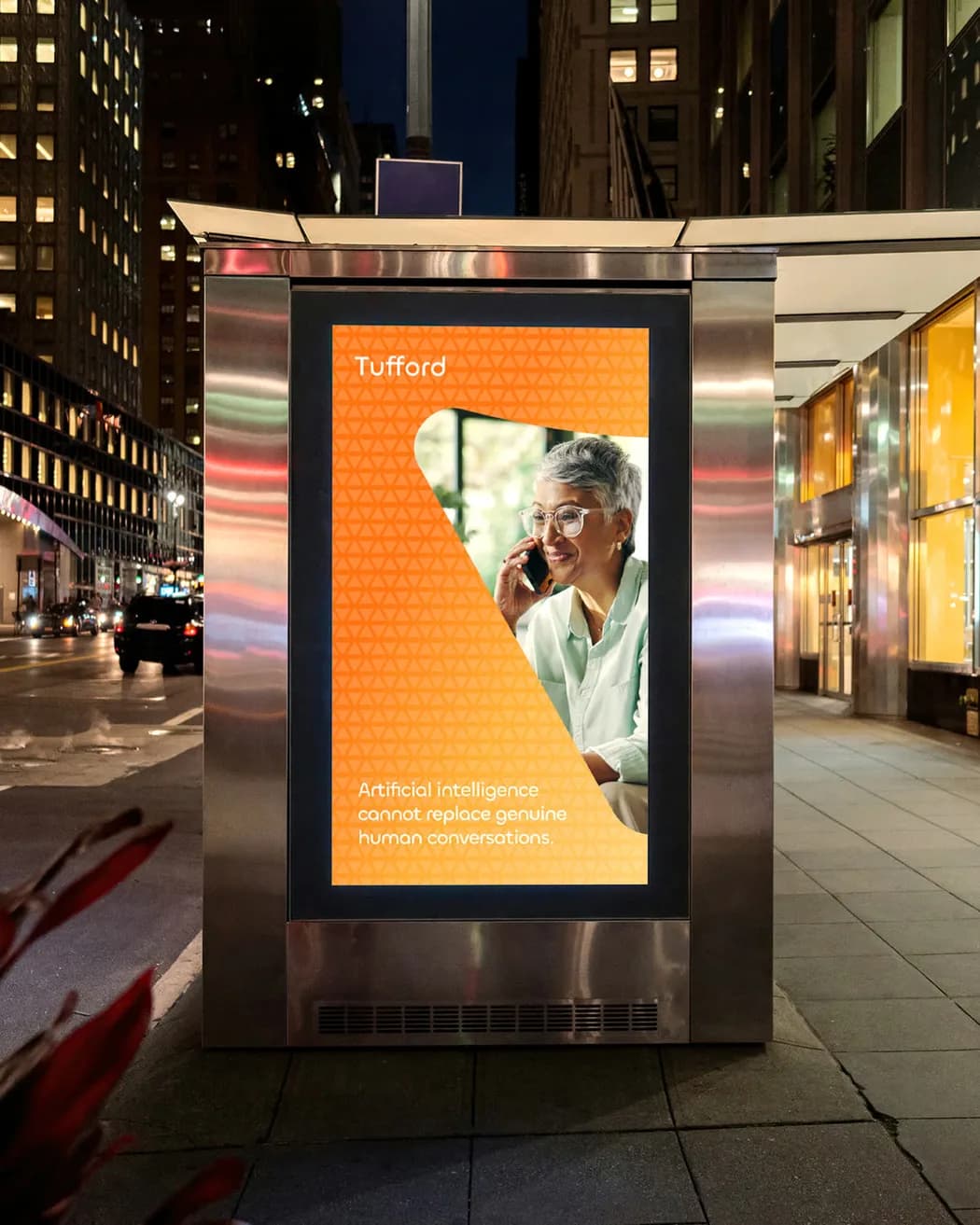
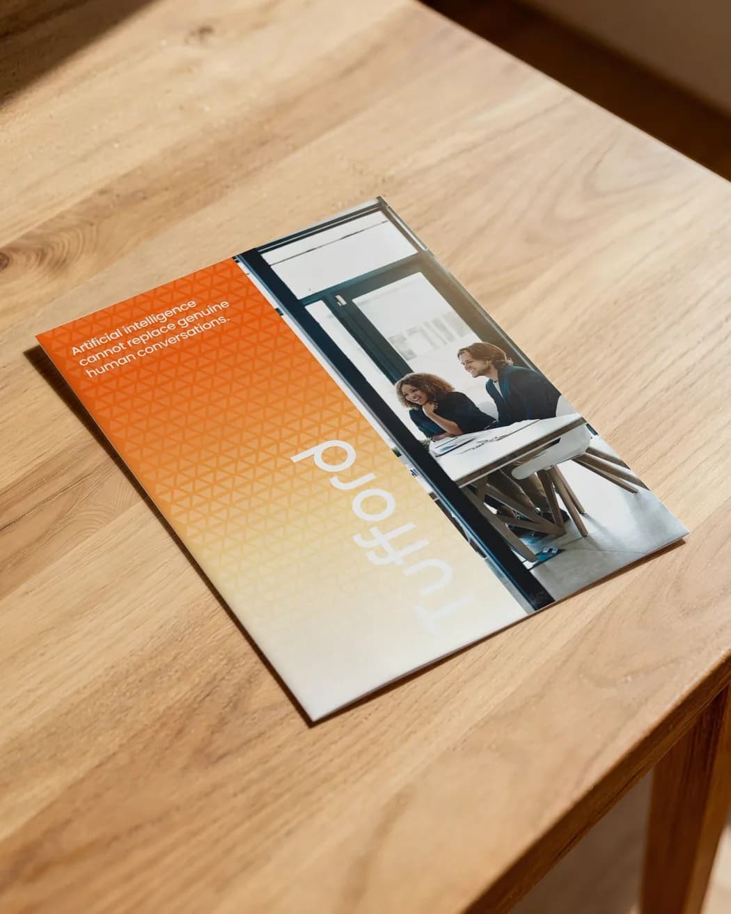
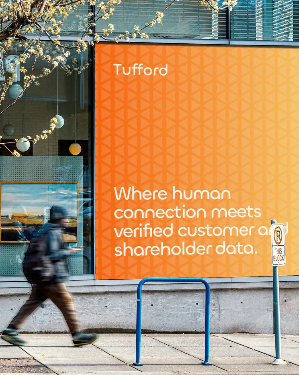
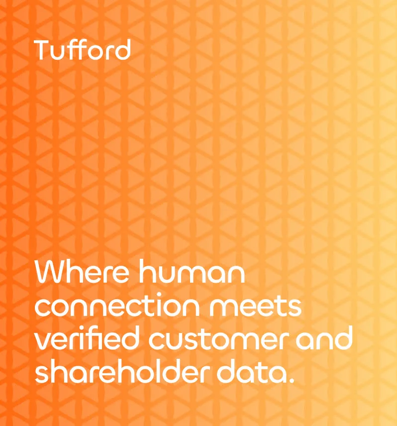
The words and the key visual; the panel and the colour in motion; the street, the brochure and the window; the mark, the pattern and the line typed in.
This wasn't about dressing something small to look big. They took our real story, the grind, the resilience, the wins, the scars, and showed it back to us with a clarity that made even us stand a little taller.
The web presence
The site opens on the line and takes the reader to the people behind it.
The home page opens on the sentence about client and shareholder records, then who the work is for, the results and the verification process. It is set in the same faces and on the same gradient as the stand and the card. The rest of this chapter is the live site and the renders made for it.

The home page, as rendered for the launch.
The site, recorded page by page.
We were past that. We just needed partners who could reveal it.
The social system
The founder speaks and the company page proves it.
The strategy gives the founder's own account the observations that already outperform the promotional, and the company page the proof: service education, client results, commentary. The pillars rotate through the week, from the relationship gap to the human touch in a digital age, and every post is set in the identity.



Three posts the company publishes: a caller, the founder’s line, and the team.
Go live
A whole identity in the world, and a company that knows why it is human.
The launch put the stand and the shirt in the one identity the week the site went live.

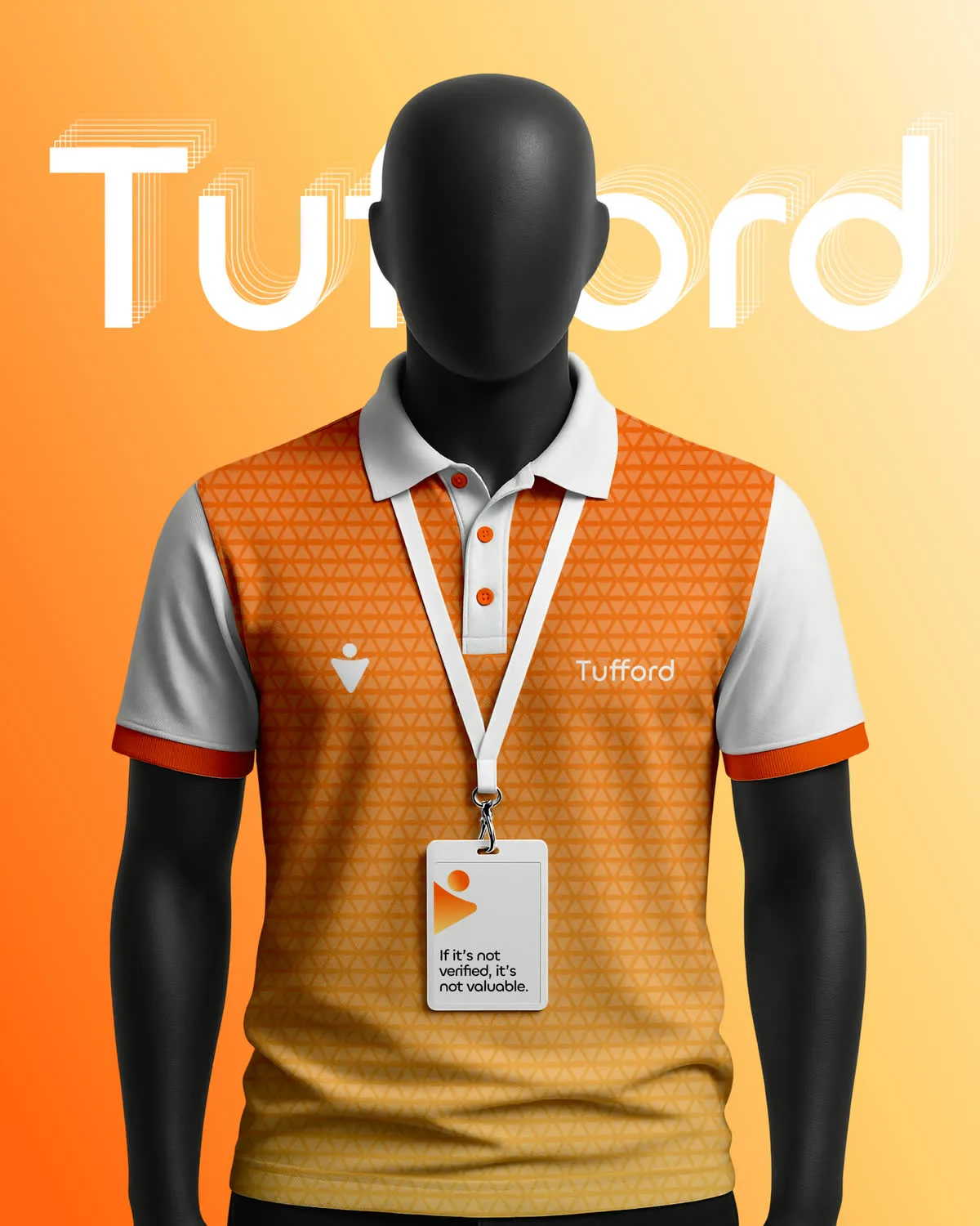
The stand and the shirt, the week the site went live.
There isn't a door out there I can't confidently walk through.Sean Tufford
- Value proposition
- Brand identity system
- Website
- Social system
- Templates

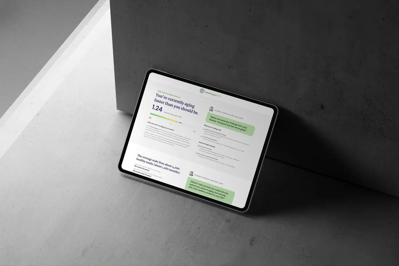
One note when there is something worth saying. Never on a schedule.
You have seen what it took here. Tell us what you are trying to win.
- A scoped plan
- A budget range
- A reply within one working day
- The right people in the room