Be distinctive and memorable
For public listed companies whose story is harder to tell than their balance sheet.
Our perspective
A brand is not the logo and it is not the guidelines document.
Perception is the thing a stranger can repeat about you after thirty seconds, and whether that thing is worth repeating. The usual failure is sameness: every listed company in the category claiming the same three virtues in the same three words. We find the proposition first, the line that says why you and not the next name on the list.
- 01Proposition and positioning
- 02Brand architecture and naming
- 03Audience and buyer insight
- 04Visual and verbal identity
- 05Identity systems built to run at speed
- 06Investor and corporate materials
- 07Motion, 3D and art direction
Teako Minerals
Evolved, not replaced: one mark, one red, and the identity worn underground.
Tufford Group
A proposition first, and the line that carries it.

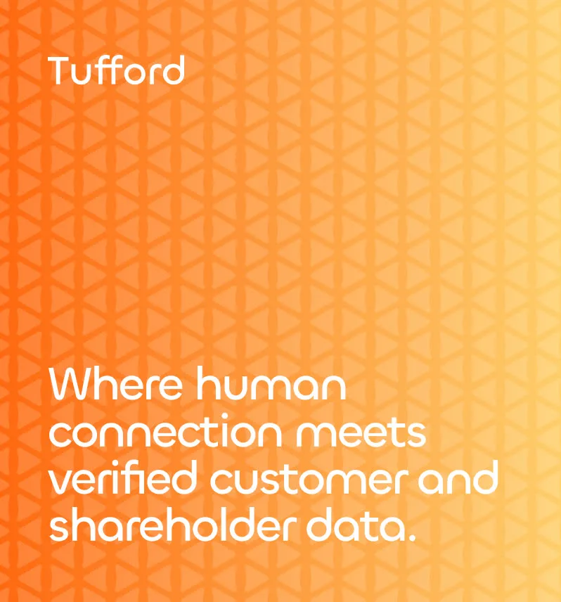
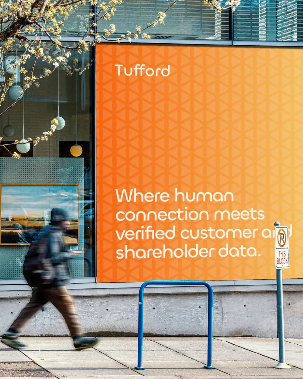
They weren’t chasing awards, applause, or creative industry ego. They were focused on one thing: taking us, and twenty years of hard-earned credibility, to the next level.
MUZO Health
One mark, on the jar, on the pack and on the sweatshirt.
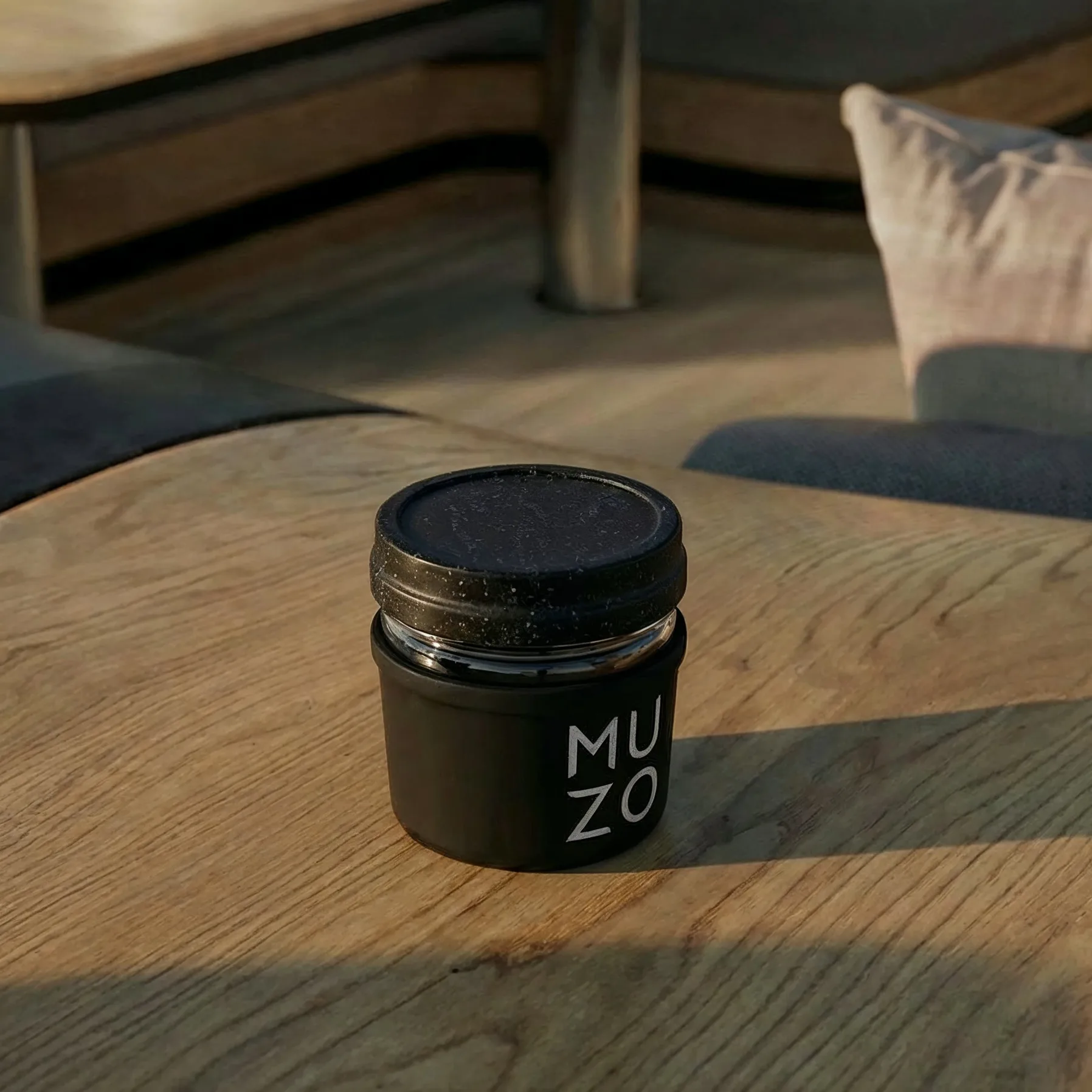
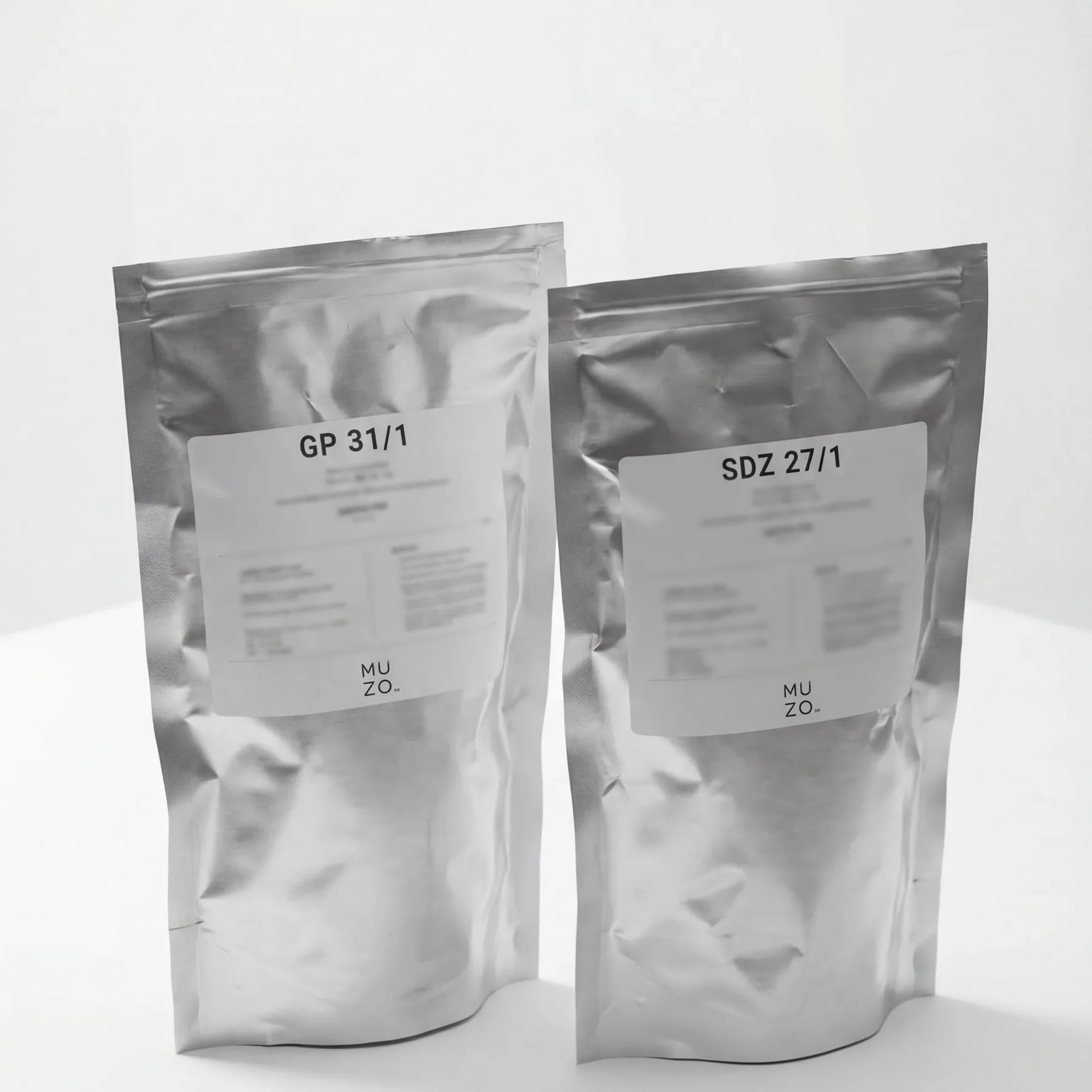
Most of this industry feels stale, like the worst part of a hospital. WAO gave us the opposite: a brand people actually feel something about.
Art By San B
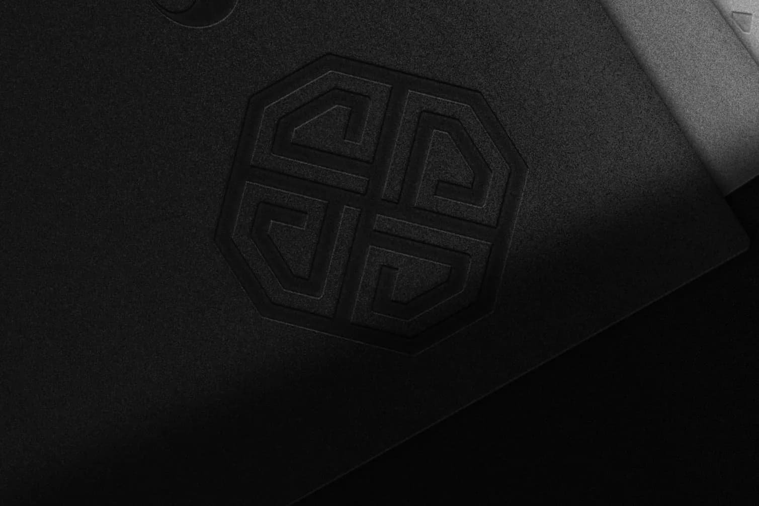
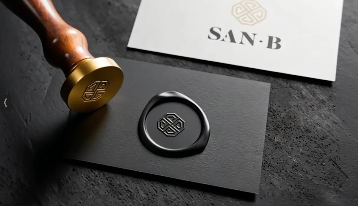
Crafting Legacy is the line; the emblem, embossed, cast and pressed in wax, is how it is kept.
I take my craft seriously, and so did the guys at WAO. What I did not bargain for was the thinking: critical, strategic, and aligned with my vision. They challenged me.
Questions buyers ask
One note when there is something worth saying. Never on a schedule.
Tell us which room you are in and we will ask the right questions.
- A scoped plan
- A budget range
- A reply within one working day
- The right people in the room